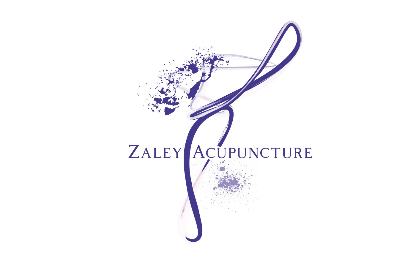
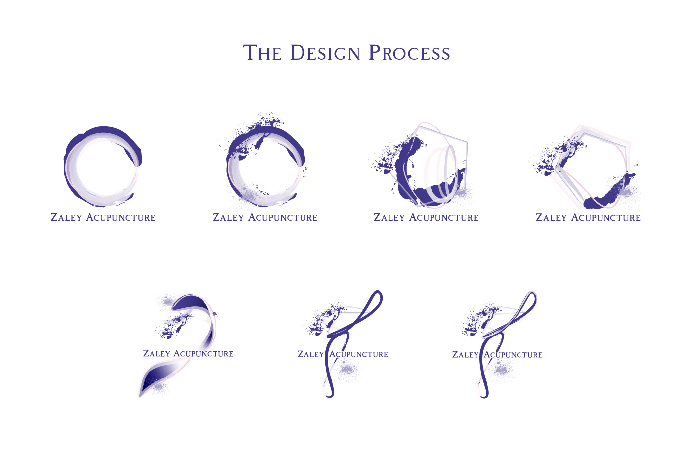
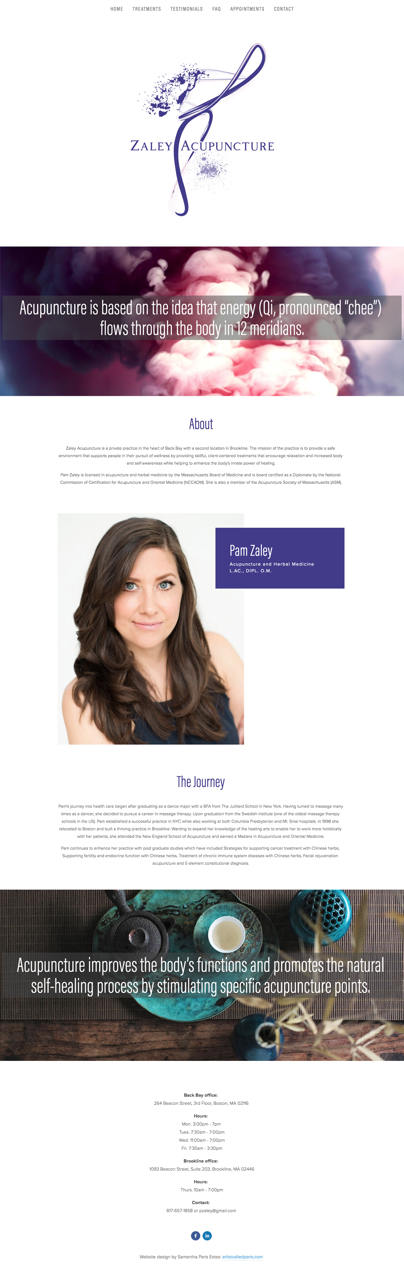
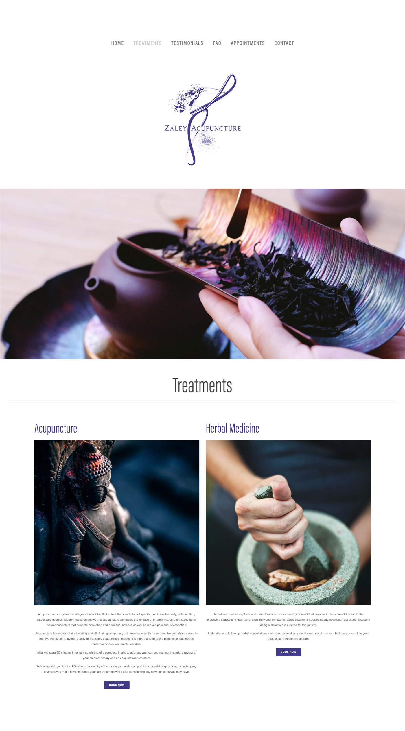
Zaley Acupuncture approached me to design their logo and website knowing my background as a designer, and abstract artist. Zaley really wanted an identity that was abstract and modern - not your traditional yin and yang symbol. I absolutely loved this approach and was up for the challenge.
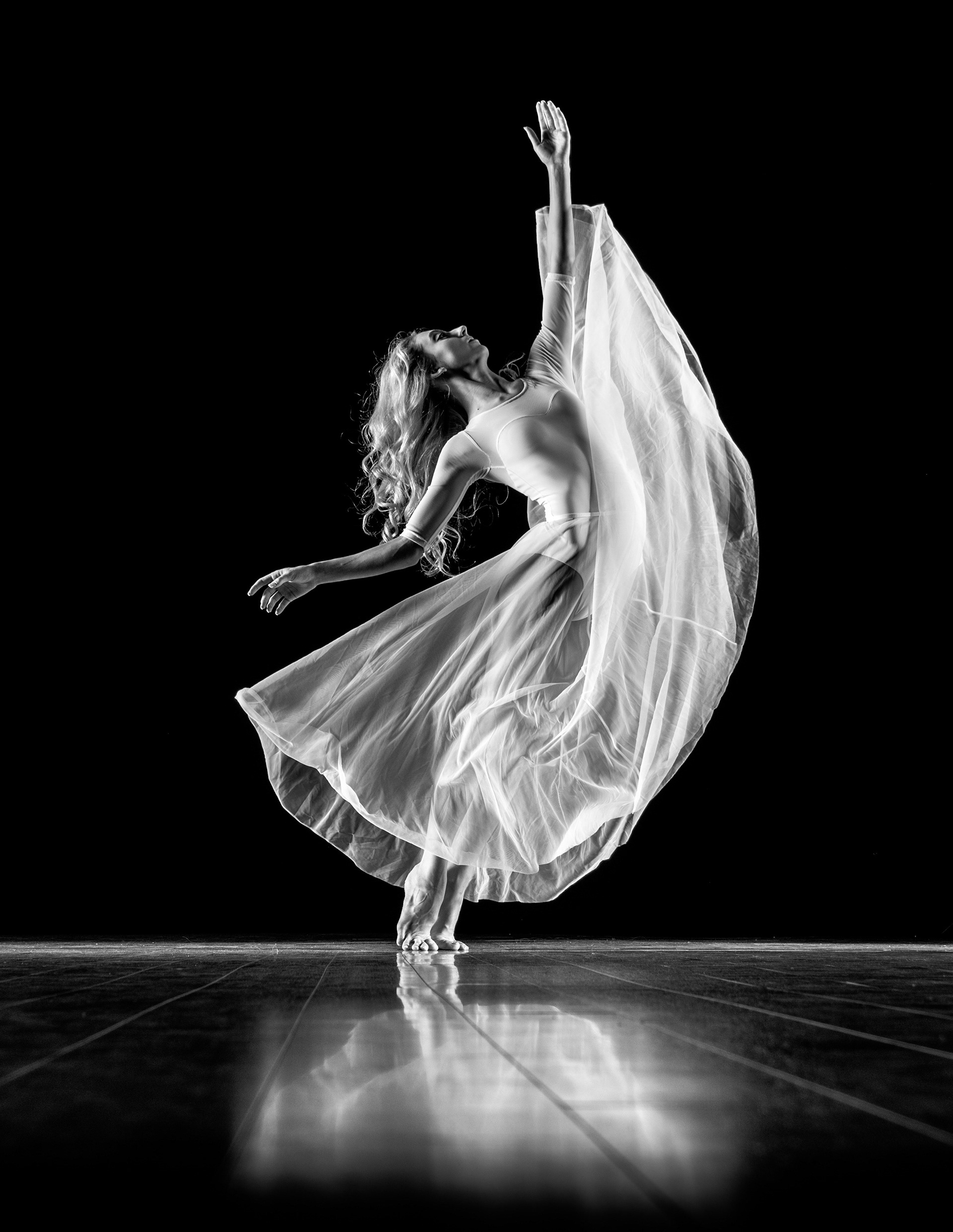
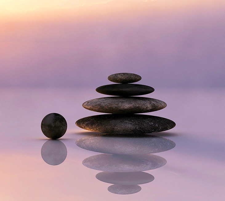
Acupuncture is based on the idea that energy (Qi, pronounced “chee”) flows through the body in 12 meridians. By stimulating specific points throughout the body, acupuncture helps improve the body’s functions and promotes the natural self-healing process. I kept reiterating to myself, "This movement and energy is what creates healing". The challenge was: how do I create this visually?
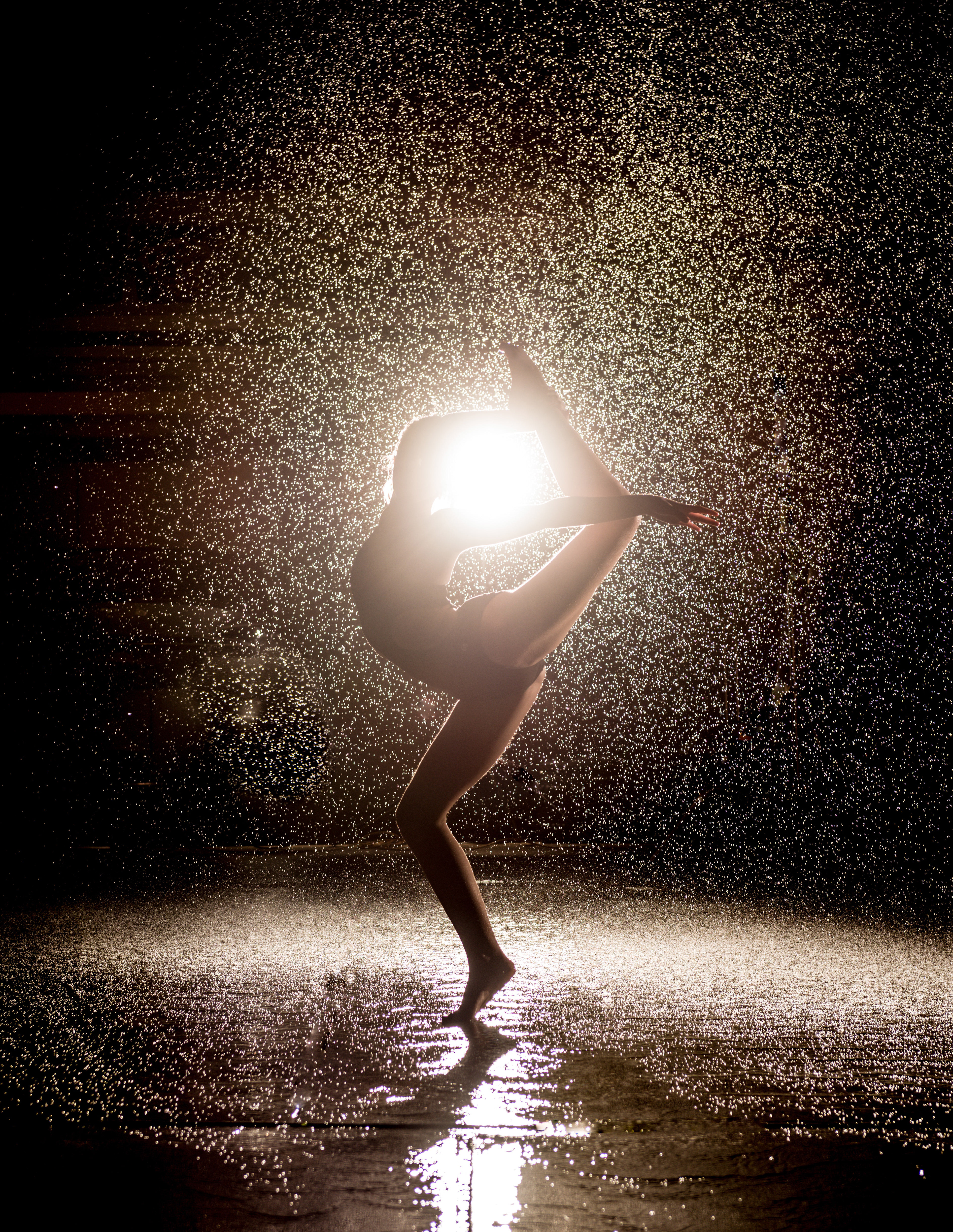
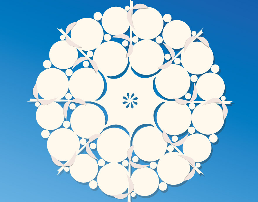
I began to look at body movement, and specifically dancers, in order to achieve this flow visually. The brush strokes provide an
abstract effect to the logo while conveying a sense of energy, and movement, with a modern look and feel.
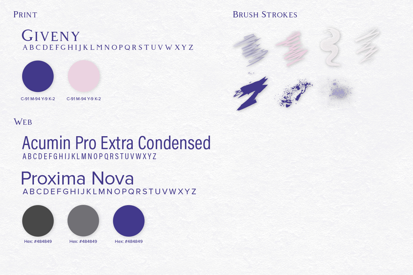
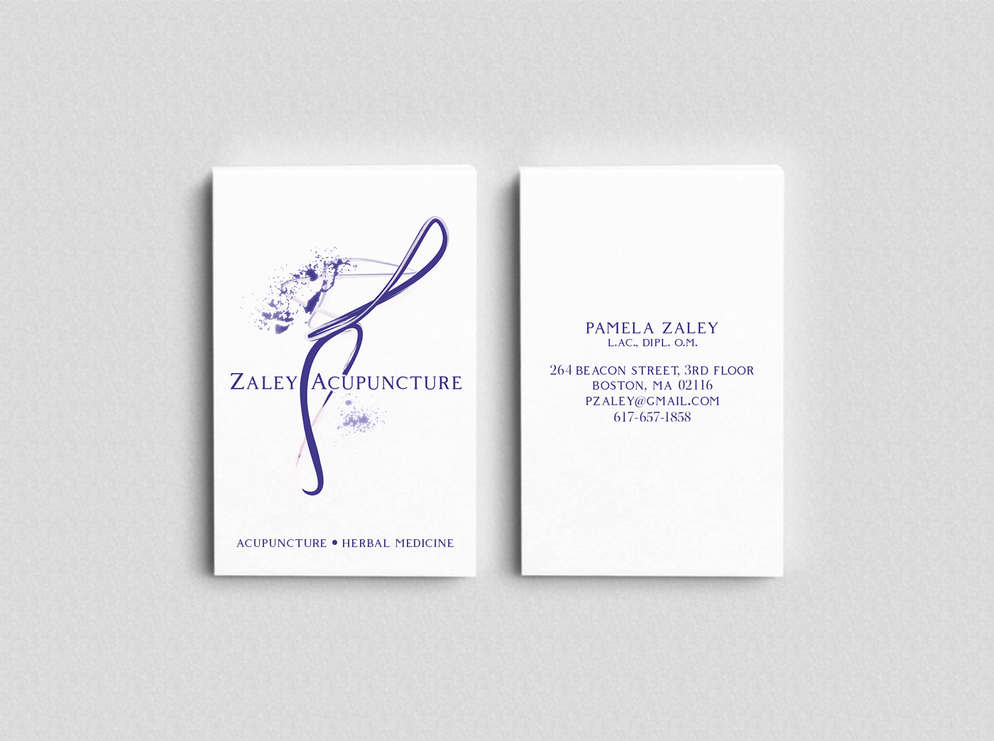
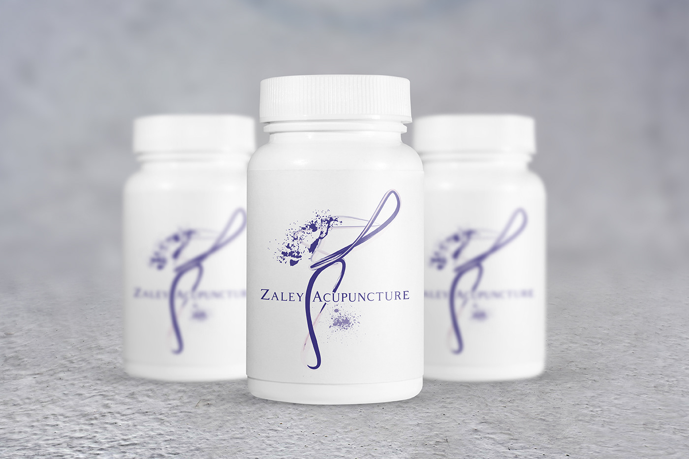
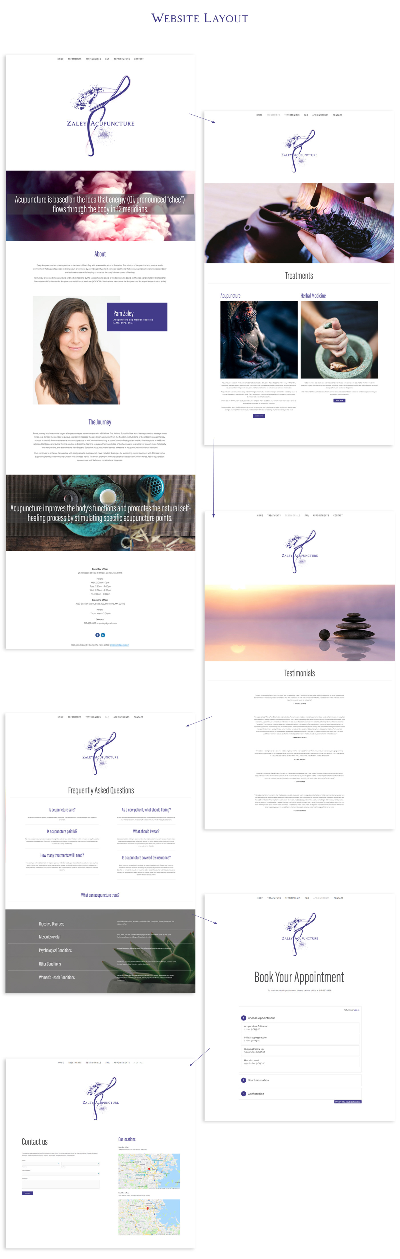
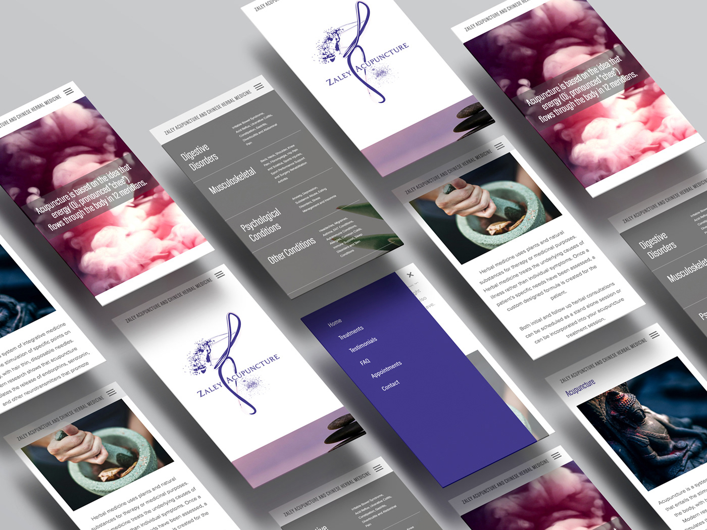
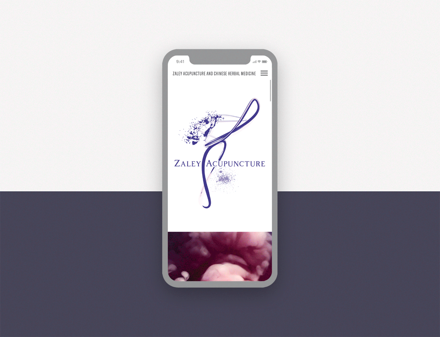
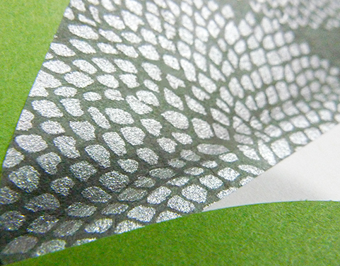
The logo was designed for various items such as business cards, labels for herbs, and a website design. The business cards were printed full color with a spot gloss over the splashes of paint. I used the gloss to enhance the logo's movement and to create a textured look.
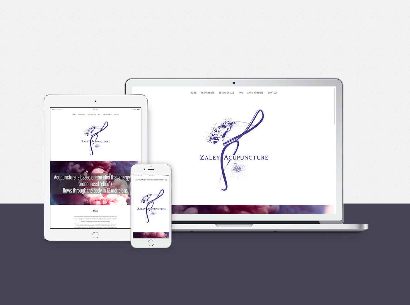
The website received an American Web Design Award from GDUSA and will be highlighted in the 2019 July issue.
Acupuncture is based on the idea that energy (Qi, pronounced “chee”) flows through the body in 12 meridians. By stimulating specific points throughout the body, acupuncture helps improve the body’s functions and promotes the natural self-healing process. I kept reiterating to myself, "This movement and energy is what creates healing". The challenge was: how do I create this visually?
I began to look at body movement, and specifically dancers, in order to achieve this flow visually. The brush strokes provide an
abstract effect to the logo while conveying a sense of energy, and movement, with a modern look and feel.
The logo was designed for various items such as business cards, labels for herbs, and a website design. The business cards were printed full color with a spot gloss over the splashes of paint. I used the gloss to enhance the logo's movement and to create a textured look.
The website received an American Web Design Award from GDUSA and will be highlighted in the 2019 July issue.