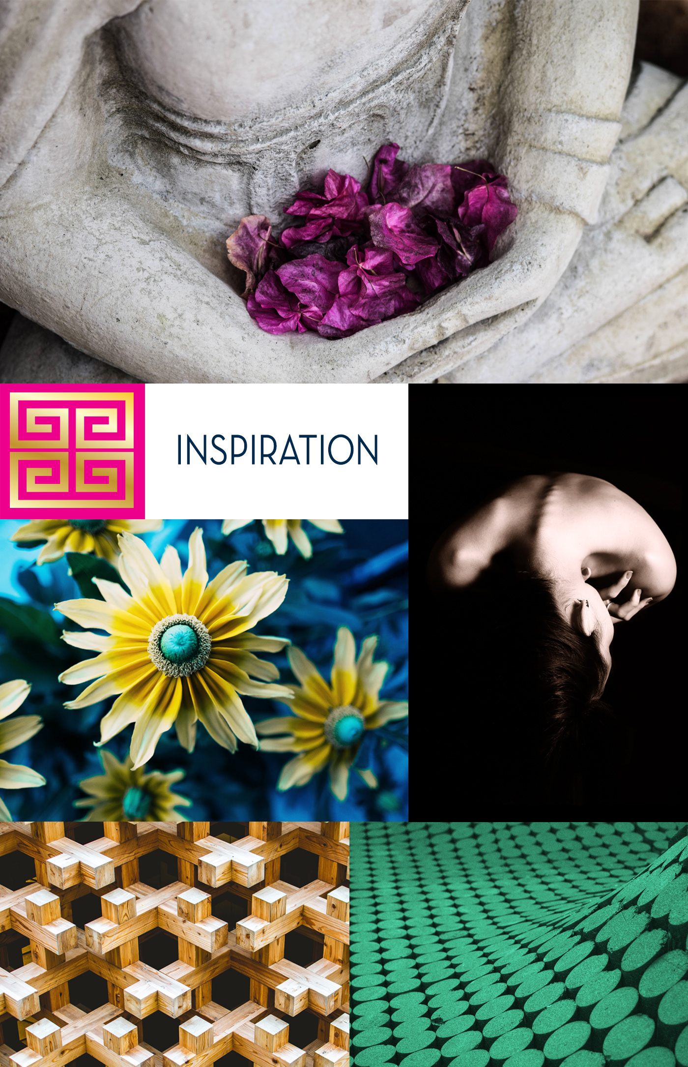
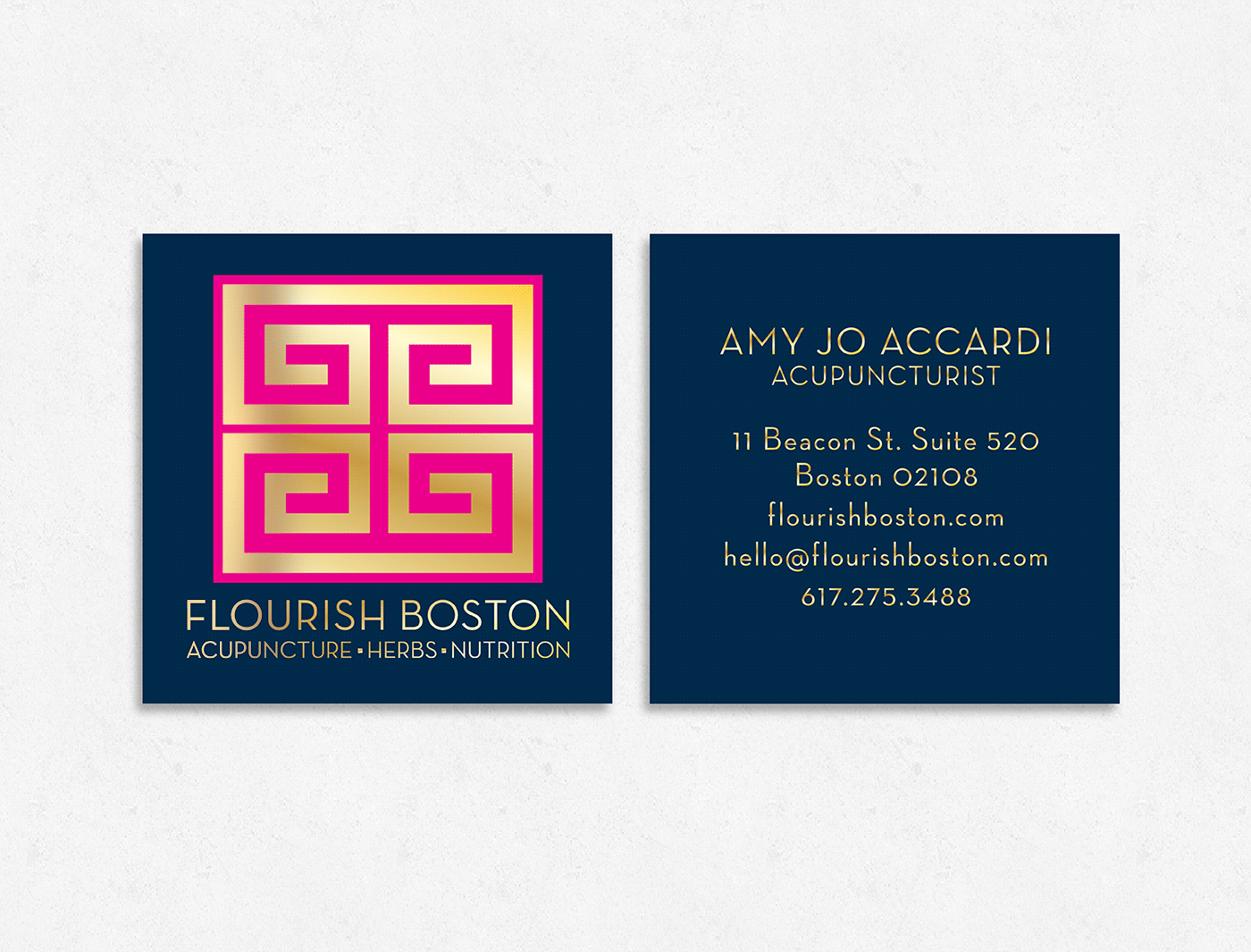
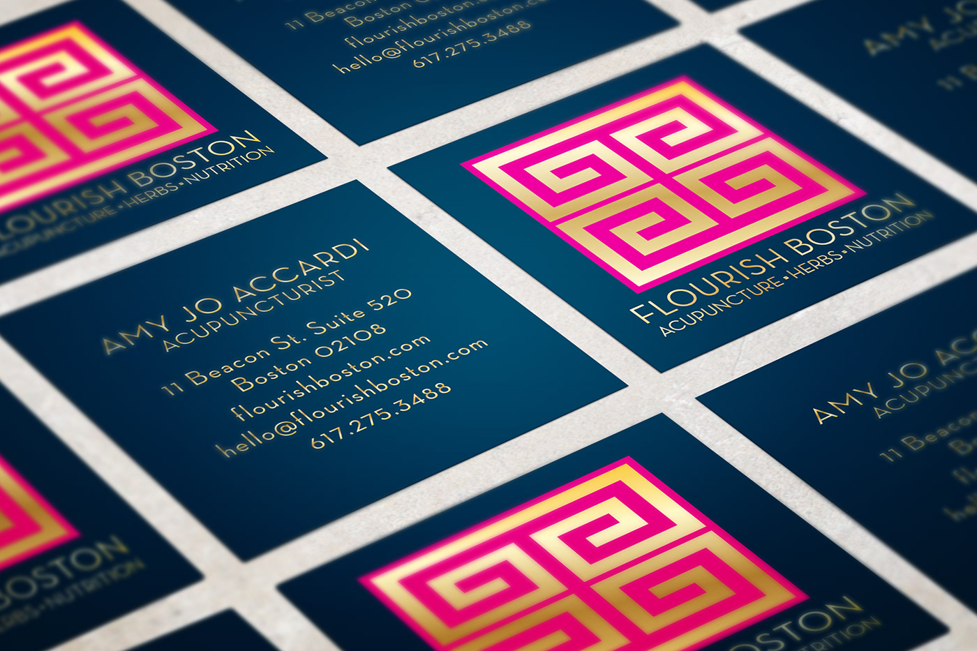
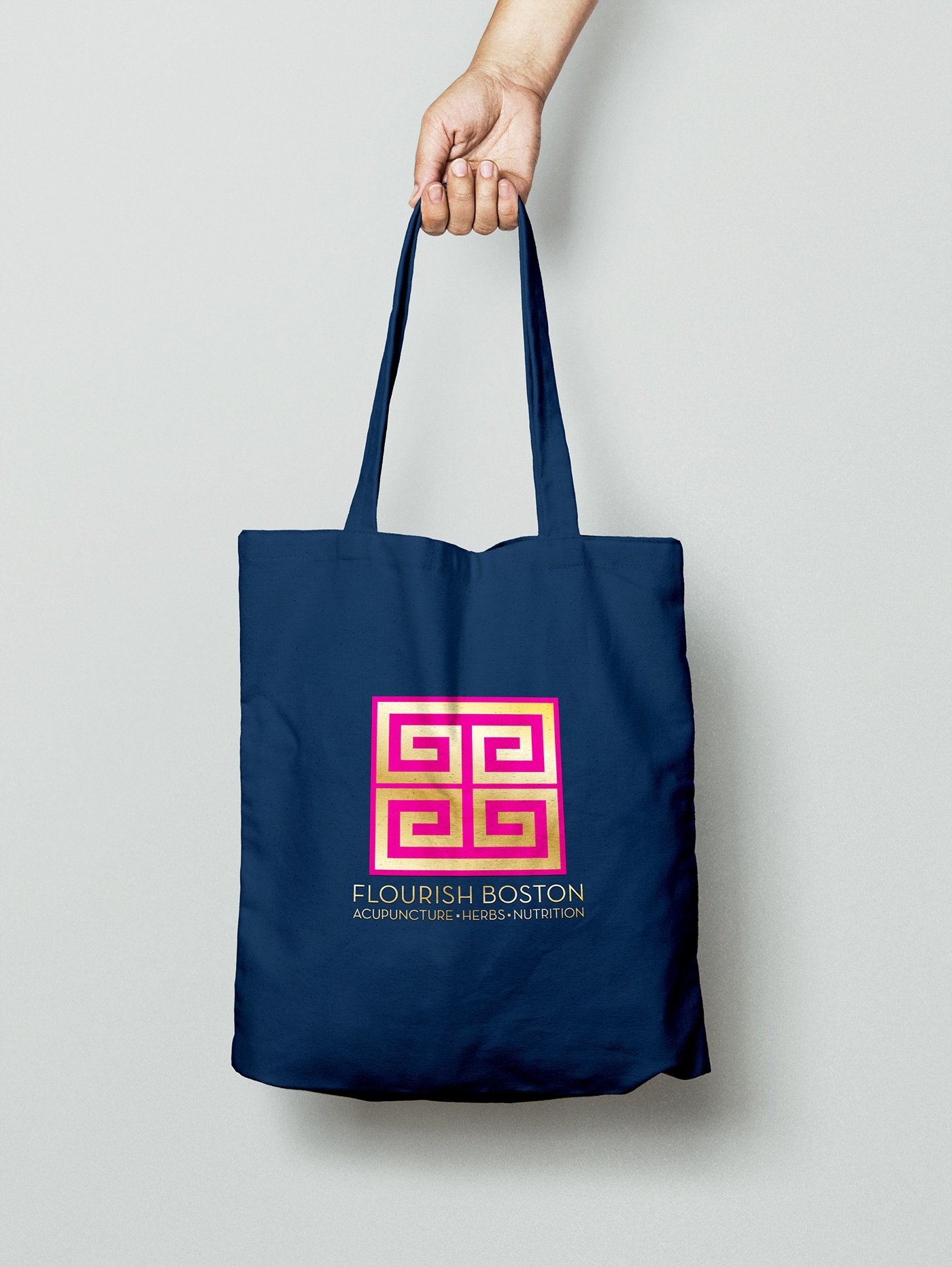
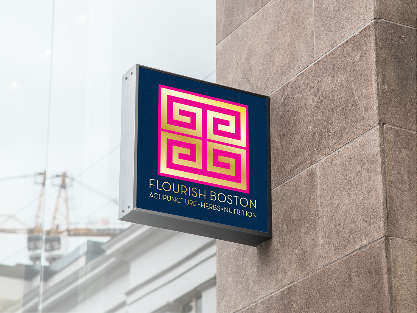
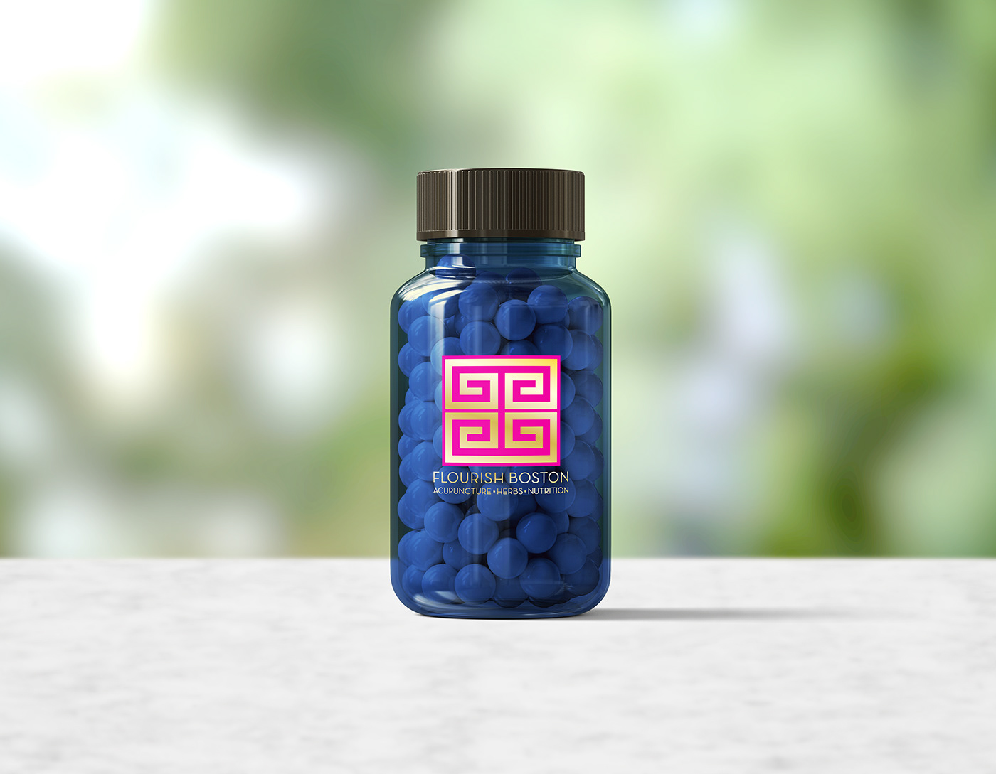
A Boston based acupuncture client wanted a brand that would convey a certain style complimentary to the decor of the office, and the clientele. I pulled resources with patterns, colors, Chinese knots, and Greek keys to reflect both of these needs. I wanted to Illustrate the energy that flows through the meridians in our body when receiving acupuncture and the balance that you find with treatment. The symmetrical line work was very important, and represents the movement of energy that all of these practices provide for our bodies. The balance you see within each concept interprets the balance we seek in life through acupuncture, herbs and nutrition. I chose a sleek, fashion font that I think really compliments the style, as well as the logo.
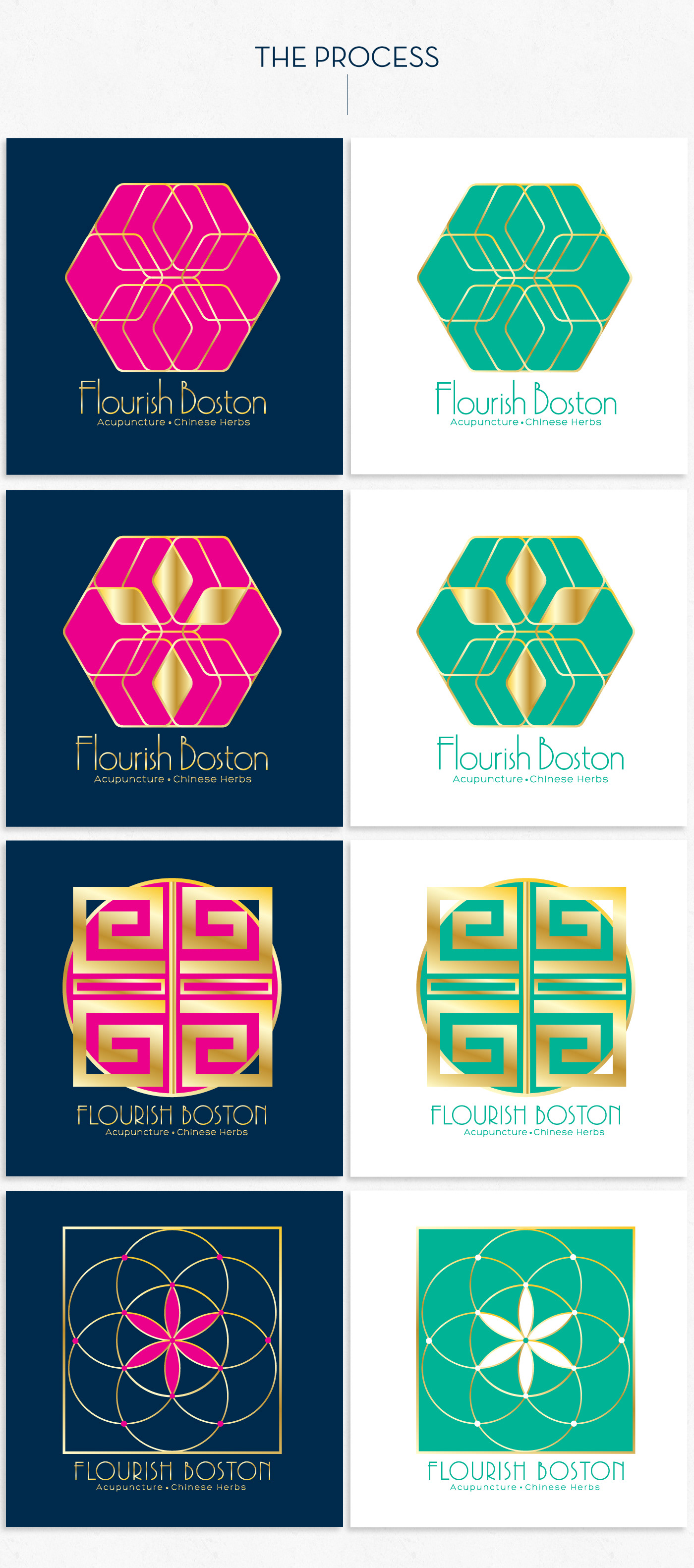
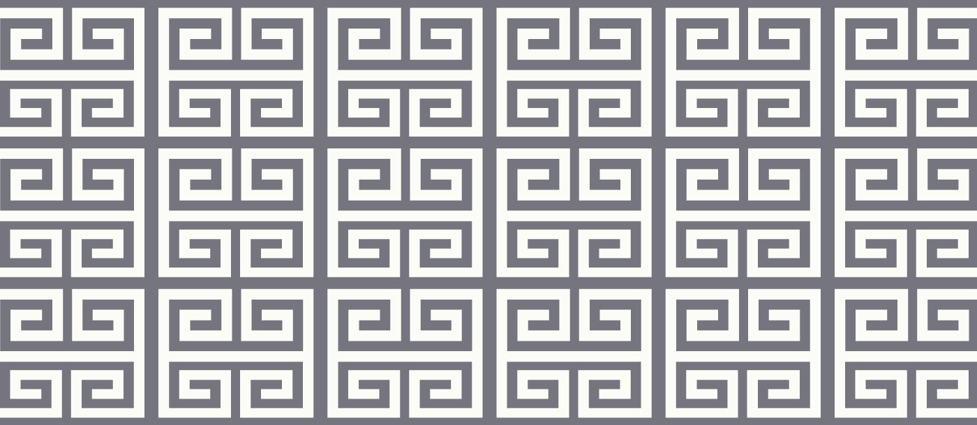
Final modifications of the logo were made to resemble a Greek key. The two pieces were conceptually thought of like the Yin and Yang. The strength and unity of these two keys, and structured lines, resemble the pathways in the body along which vital energy is said to flow through.
Final modifications of the logo were made to resemble a Greek key. The two pieces were conceptually thought of like the Yin and Yang. The strength and unity of these two keys, and structured lines, resemble the pathways in the body along which vital energy is said to flow through.