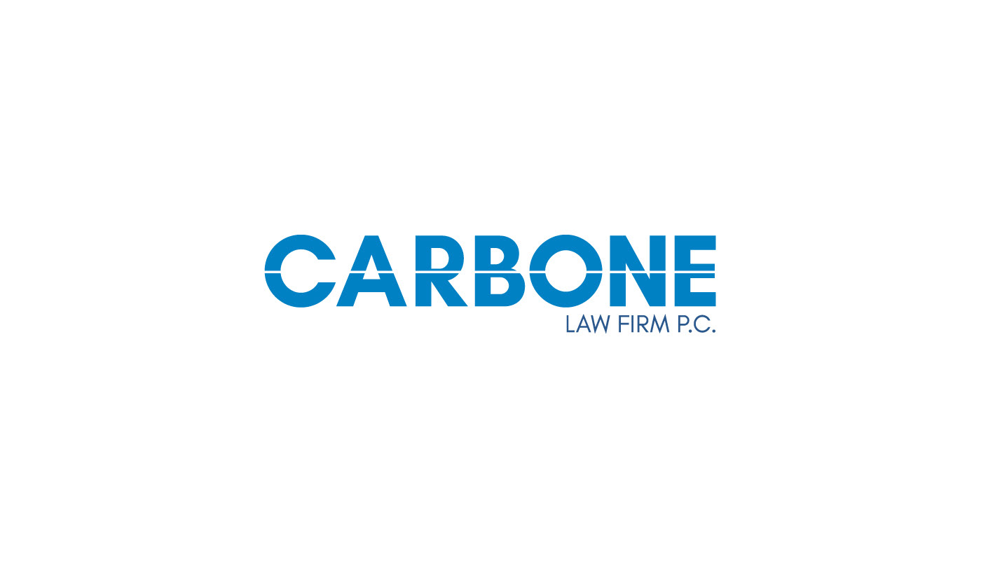
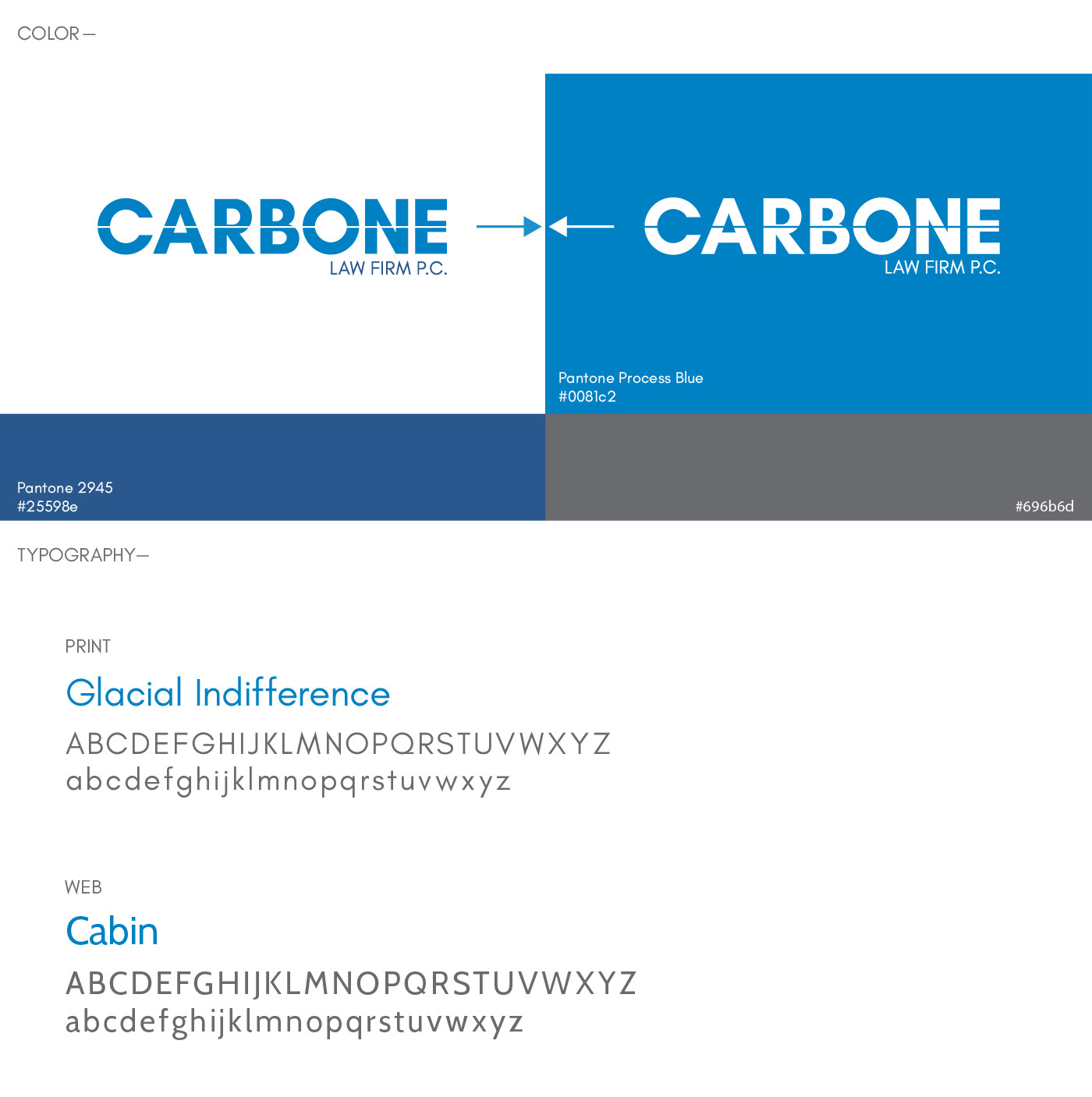
Carbone Law Firm asked me to design a logo and website. Mr. Carbone, a divorce attorney, wanted a modern and fresh look to his practice. He had been using basic business cards and a older website layout that was built many years ago. The new logo and website were designed with the intent to be clean, simple and professional. Divorce being a serious subject, the logo needed to make men, and women alike, feel that this law office could be approached and trusted.
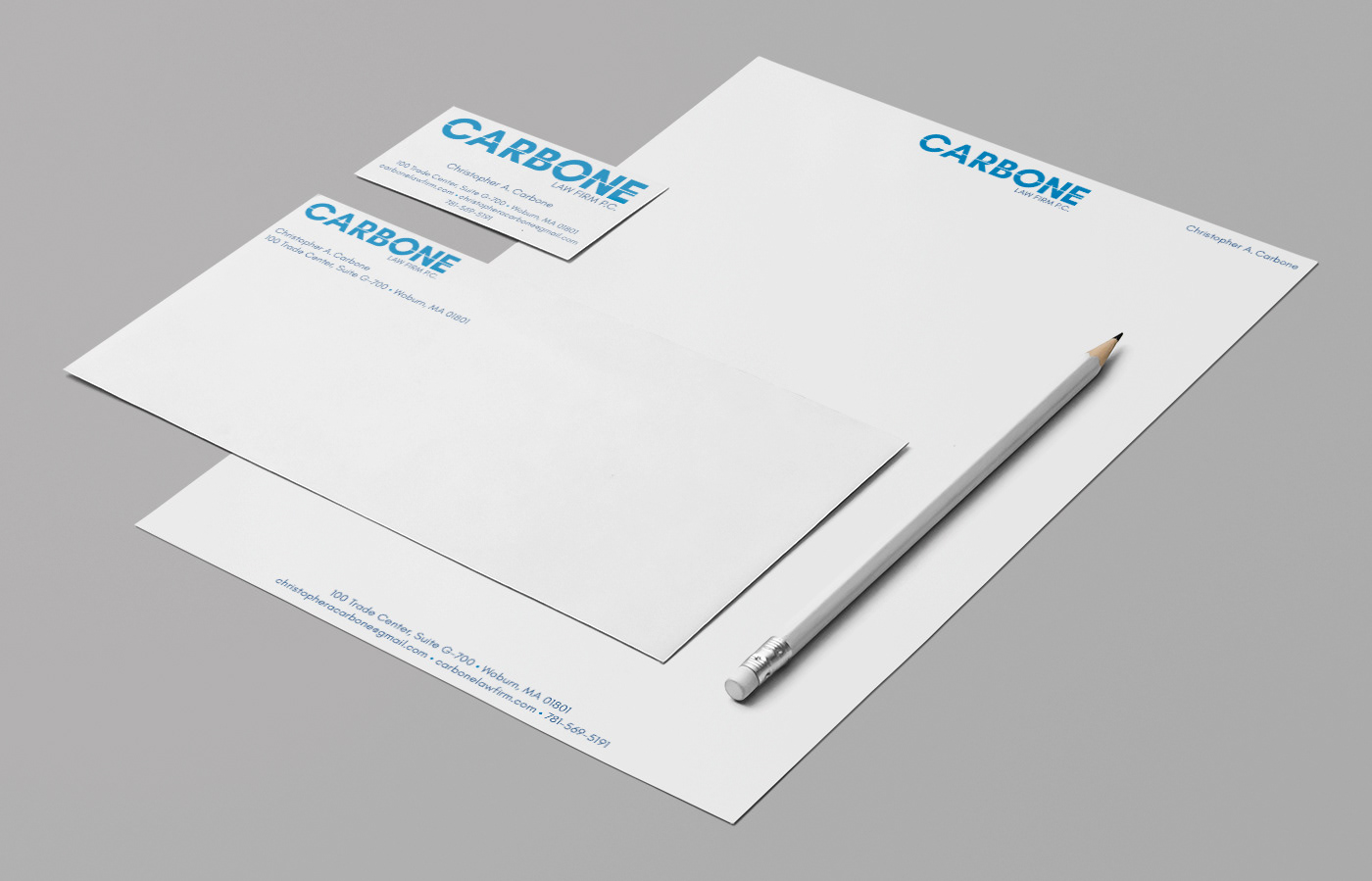
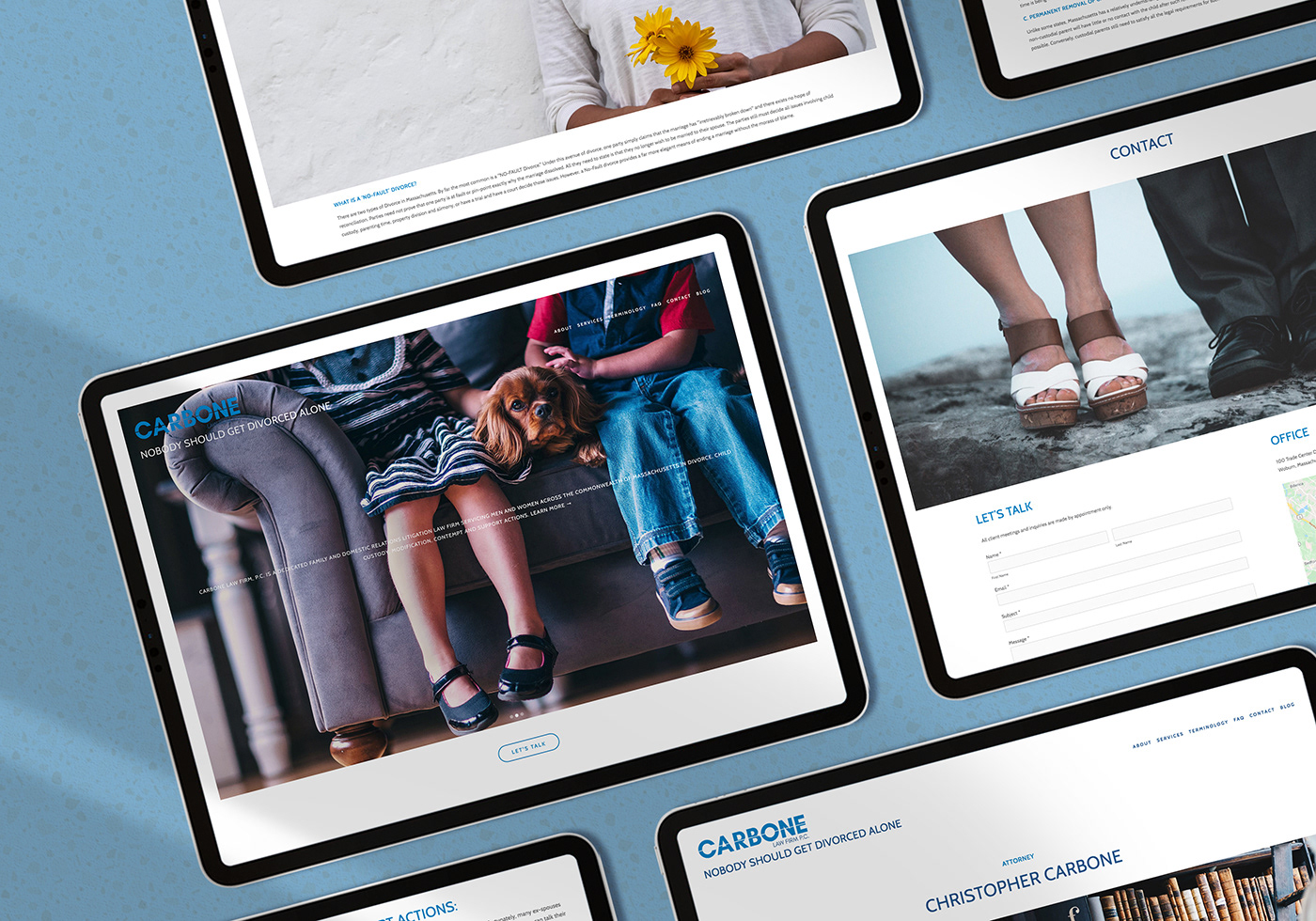
The white line in the logo signifies a split. A half, or separation, not only of couples but the separating of assets, custody of children and the many other situations that come along with the process. The logo was applied to a stationary kit (letterhead, business card, and envelopes).
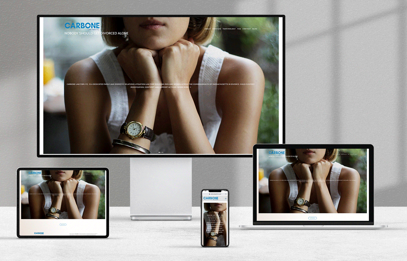
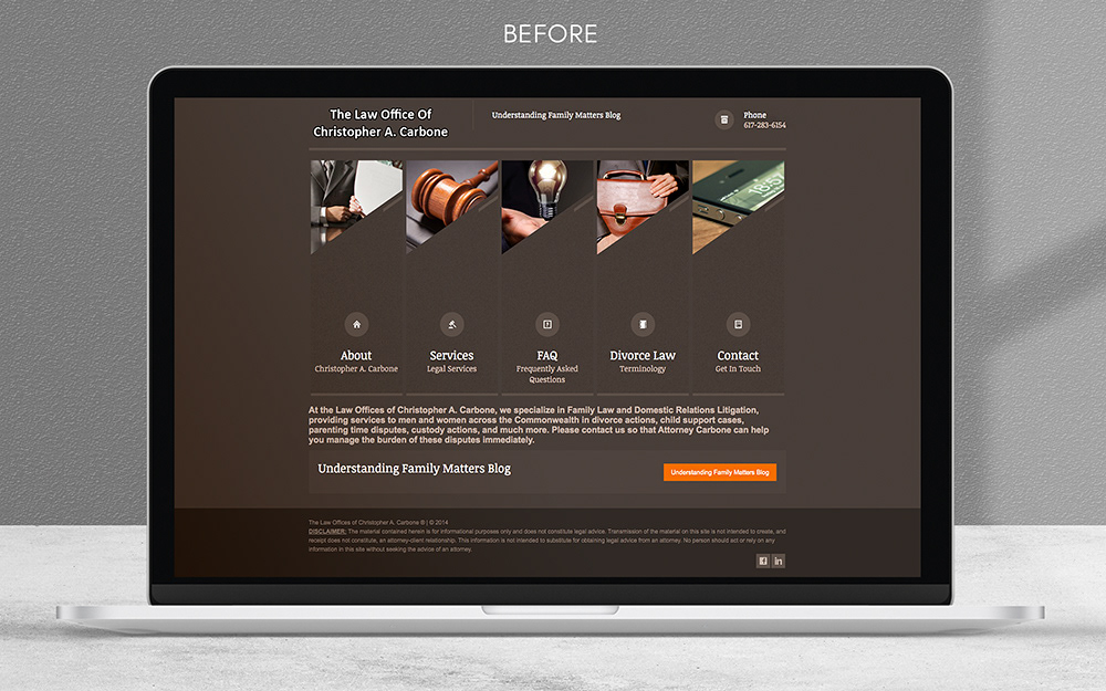
The website before the redesign had a brown background with a heavy amount of information. The navigation was also not user- friendly. This led the end user to have to hunt for information under several drop down menus. In addition, the white content on a brown background made content difficult
to read.
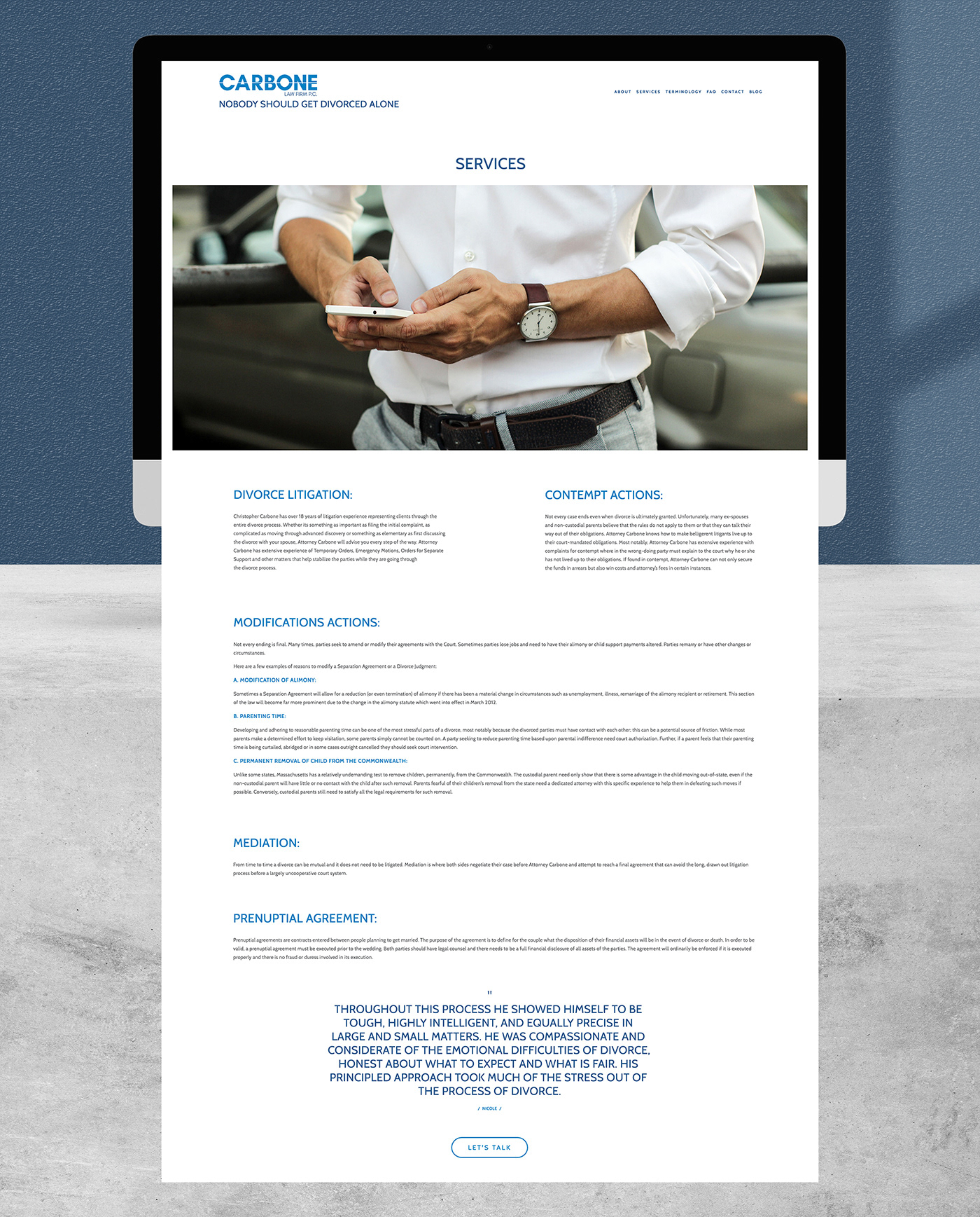
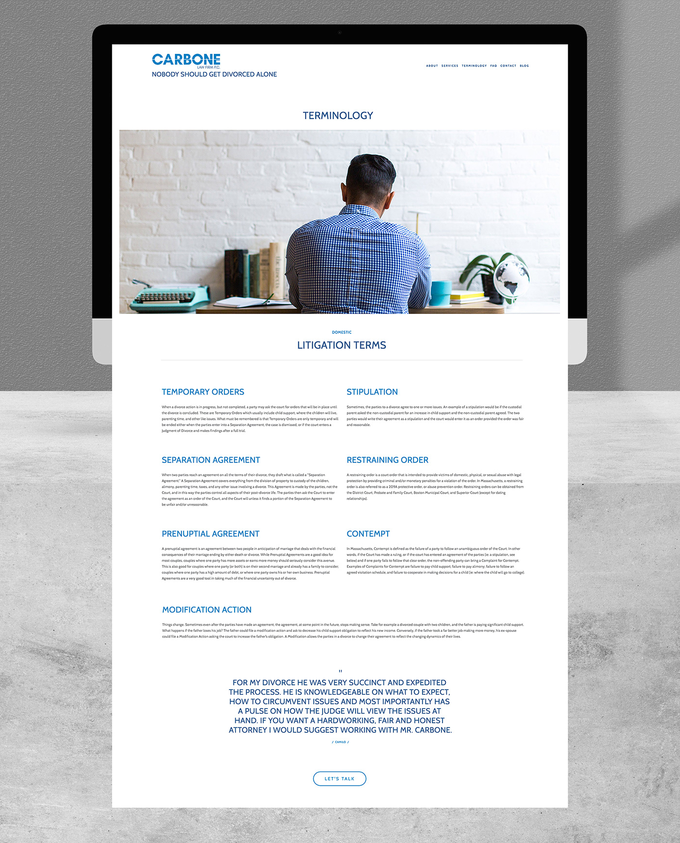
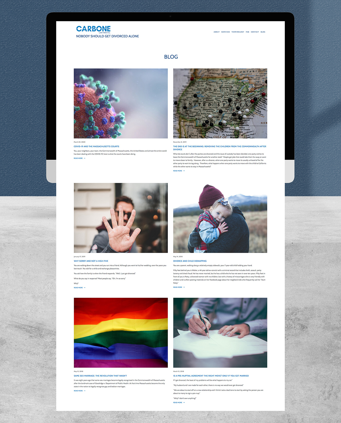
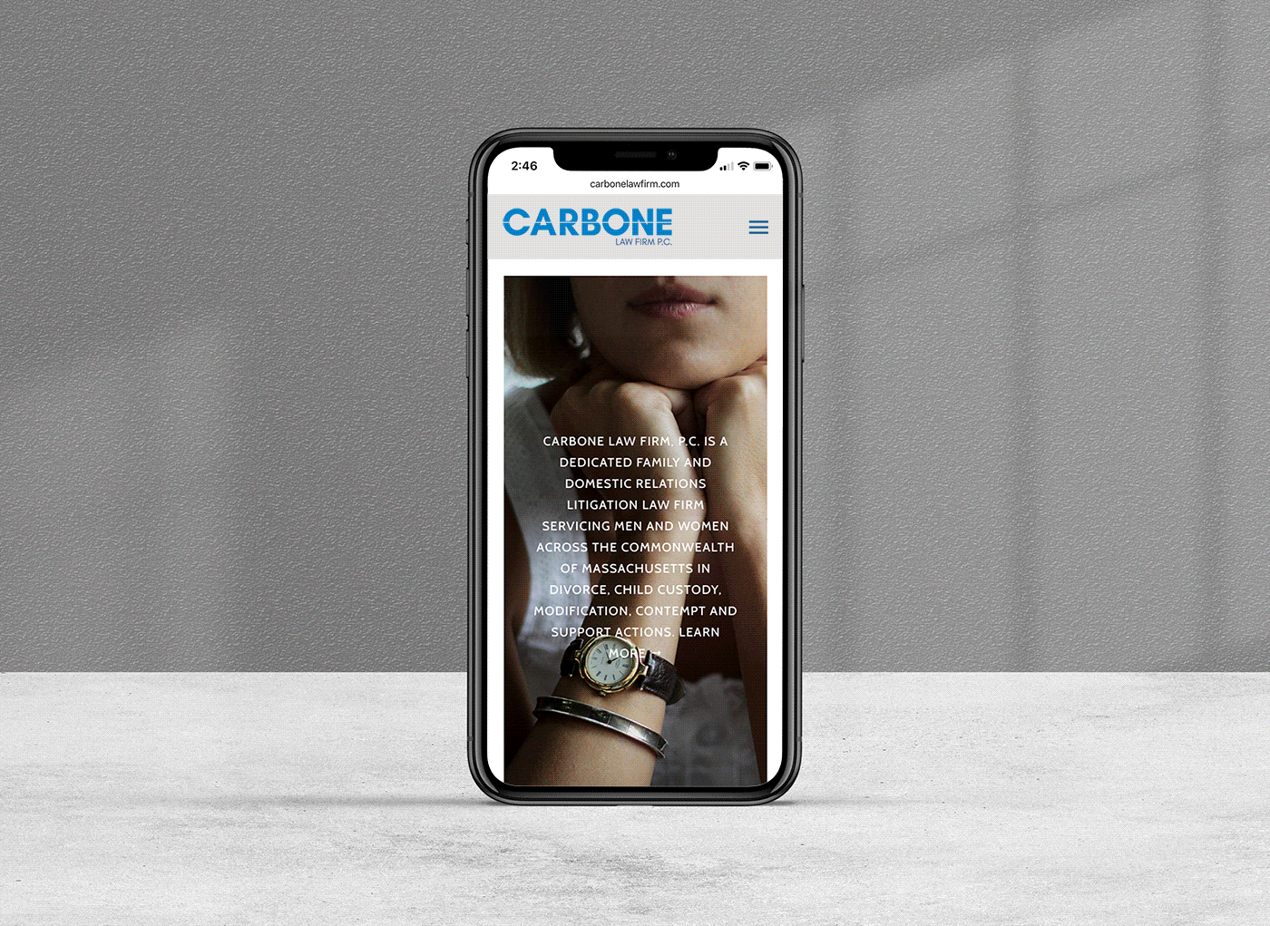
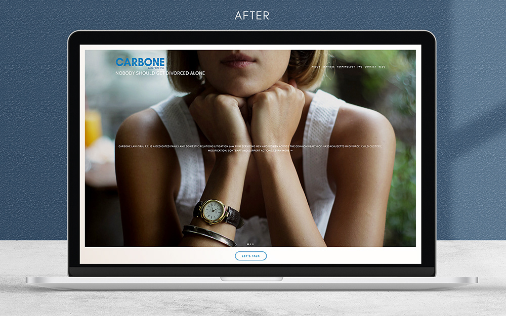
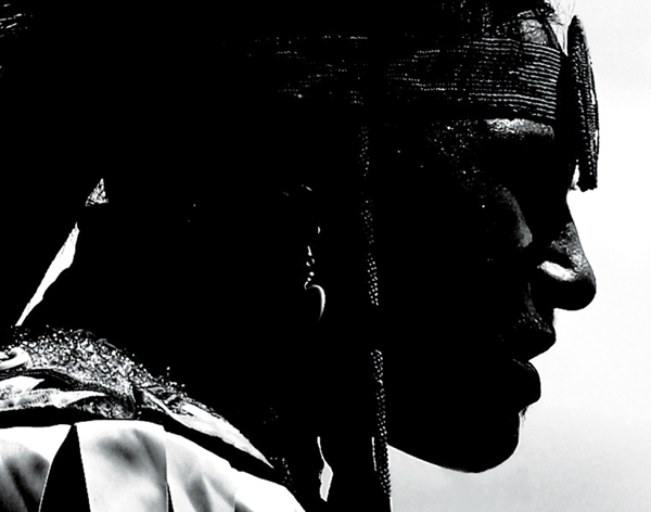
I worked with Mr. Carbone to keep the information that was critical, and designed a wireframe that was clean and user-friendly. Clients could find what they needed easily and there is a point of contact on each page making it stress free and accessible. The website was designed to make the client feel like they could approach the attorney and not feel intimidated or overwhelmed by their personal situation. When selecting the photography this needed to be kept in mind as well. It was important to showcase men, women and children. If you look closely you don't see any faces in the photography selected. This was done intentionally to evoke a sense of privacy. Lastly, Mr. Carbone has a blog that he showcases on his site, and with the new layout, he can share his posts on social media and visitors can react to posts.
The white line in the logo signifies a split. A half, or separation, not only of couples but the separating of assets, custody of children and the many other situations that come along with the process. The logo was applied to a stationary kit (letterhead, business card, and envelopes).
The website before the redesign had a brown background with a heavy amount of information. The navigation was also not user- friendly. This led the end user to have to hunt for information under several drop down menus. In addition, the white content on a brown background made content difficult
to read.
I worked with Mr. Carbone to keep the information that was critical, and designed a wireframe that was clean and user-friendly. Clients could find what they needed easily and there is a point of contact on each page making it stress free and accessible. The website was designed to make the client feel like they could approach the attorney and not feel intimidated or overwhelmed by their personal situation. When selecting the photography this needed to be kept in mind as well. It was important to showcase men, women and children. If you look closely you don't see any faces in the photography selected. This was done intentionally to evoke a sense of privacy. Lastly, Mr. Carbone has a blog that he showcases on his site, and with the new layout, he can share his posts on social media and visitors can react to posts.